All about AnnotatedString (Jetpack Compose)

AnnotatedString is the basic data structure of text with multiple styles. We can use AnnotatedString for creating all special texts like
- Multiple styles in a text
- Clickable text
- Text with some icon
We have seen these texts in almost every application right. Let’s build them with compose.
Multiple styles in a text
To set different styles within the same Text composable, you have to use an AnnotatedString, a string that can be annotated with styles of arbitrary annotations.
AnnotatedString is a data class containing:
- A
Textvalue - A
ListofSpanStyleRange, equivalent to inline styling with position range within the text value - A
ListofParagraphStyleRange, specifying text alignment, text direction, line height, and text indent styling
TextStyle is for use in the Text composable , whereas SpanStyle and ParagraphStyle is for use in AnnotatedString.
The difference between SpanStyle and ParagraphStyle is that ParagraphStyle can be applied to a whole paragraph, while SpanStyle can be applied at the character level. Once a portion of the text is marked with a ParagraphStyle, that portion is separated from the remaining as if it had line feeds at the beginning and end.
@Composable
fun SpanStyleInText() {
    Text(
        buildAnnotatedString {
            withStyle(style = SpanStyle(color = Color.Blue)) {
                append("J")
            }
            append("etpack ")

            withStyle(style = SpanStyle(fontWeight = FontWeight.Bold,
                                        color = Color.Red)) {
                append("C")
            }
            append("ompose")
        }
    )
}
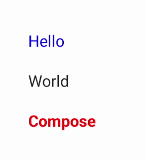
We can set ParagraphStyle in the same way:
@Composable
fun ParagraphStyleInText() {
    Text(
        buildAnnotatedString {
            withStyle(style = ParagraphStyle(lineHeight = 40.sp)) {
                withStyle(style = SpanStyle(color = Color.Blue)) {
                    append("Hello\n")
                }
                append("World\n")
                withStyle(
                    style = SpanStyle(
                        fontWeight = FontWeight.Bold, color = Color.Red
                    )
                ) {
                    append("Compose")
                }
            }
        }
    )
}
Clickable Text
This is also very common behaviour where make some part of text is clickable. Let’s try to build one.
@Composable
fun AnnotatedClickableText() {
    val annotatedText = buildAnnotatedString {
        append("Click ")

        // We attach this *URL* annotation to the following content
        // until `pop()` is called
        pushStringAnnotation(
            tag = "URL",
            annotation = "https://developer.android.com/jetpack/compose"
        )
        withStyle(
            style = SpanStyle(
                color = Color.Blue, fontWeight = FontWeight.Bold
            )
        ) {
            append("here for compose documentation")
        }

        pop()
    }

    ClickableText(text = annotatedText, onClick = { offset ->
        // We check if there is an *URL* annotation attached to the text
        // at the clicked position
        annotatedText.getStringAnnotations(
            tag = "URL", start = offset, end = offset
        ).firstOrNull()?.let { annotation ->
            // If yes, we log its value
            Log.d("Clicked URL", annotation.item)
        }
    })
}
Text With Icon
We have often seen icons within some text. One way is use Text and Icon composables and use them in single Row. Better way is to use single Text composable and embed Icon into it with the help of AnnotatedString .
@Composable
fun TextWithIcon() {
    val annotatedString = buildAnnotatedString {
        append("Delhi ")
        appendInlineContent(id = "icon")
        append(" Mumbai")
    }
    val inlineContentMap = mapOf(
        "icon" to InlineTextContent(
            Placeholder(12.sp, 8.sp, PlaceholderVerticalAlign.TextCenter)
        ) {
            Image(
                painter = painterResource(id = R.drawable.ic_arrow_roundtrip),
                modifier = Modifier.fillMaxSize(),
                contentDescription = "roundTrip"
            )
        }
    )
    Text(
        text = annotatedString,
        inlineContent = inlineContentMap,
        textAlign = TextAlign.Center,
    )
}
The good thing about AnnotatedString is that we can append one to another while adding new modifications!🤘
If you find this post helpful, don’t forget to clap 😊
Happy Composing! 👋


